

DATA DRIVEN TEACHING
- Design a report that provides teacher with actionable insights into student's performance
Embedded Assessment Measure (EAM) is one of Amplify Education's new data visualization product which aims at providing a Fitbit-like ongoing measure that tracks student learning performance on the core skills. The goal is to help teachers quickly interpret the students' learning outcome and give differentiated instructions.
Scope and Duration
December 2018 - May 2019
(6 months)
Team
1 Product Manager
1 Data Scientist
Curriculum & Assessment Experts
4 Engineers
1 QA
1 UX/UI Designer - ME
My Contribution
I owned the full design cycle which includes user research, UX/UI design, prototyping, user testing.
Tools
Sketch
Invision
Zeplin
BACKGROUND
In Amplify ELA digital curriculum, within a unit every 4-5 lessons there is a special lesson called "Flex Day", which is intended for the teacher to give students personalized instructions based on their learning needs. However, many teachers have not been using Flex Days intentionally, because they didn't have a way of tracking and interpreting student performance.
To improve the user engagement, learning research team identified the need of developing an embedded assessment measure to serve just like a Fitbit, telling the teacher how their students' learning is going and what intervention they need to give to each student periodically.

USER INSIGHTS

Opportunity
How might we design an effective reporting solution that:
-
deepens user's understanding of student learning;
-
doesn't add extra burden to user;
-
and most importantly, is simple yet actionable?
PROCESS
On site / remote interviews with teachers and instructional coaches from NYC and California.

Understanding back-end data through talking to Analytics team
Working with Dev Team based in Atlanta
EARLY IDEAS
Our hypothesis was, the teacher needs both class-level data and student-level data; they also need data for both specific pivotal moments and long-term tracking purpose. Based on this preliminary assumption, I experimented with as many types of data visualizations as possible at the beginning to get the sense of what might be the best way of surfacing the insights.

ITERATION BASED ON UESER TESTING
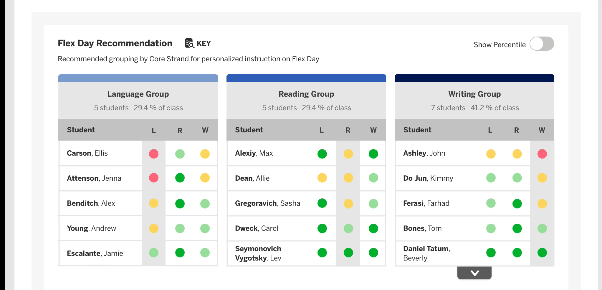
As soon as I realized the purpose of the data visualization of EAM is helping the teacher identify students' needs in learning and give differentiated instructions, I started to focus my attention on
coming up with a grouping visual that gives the teacher a quick grasp of students weakness. However, how much information should we give users?
To get the answer to this question, we conducted 3 rounds of user testing and based on the feedback received I did several iterations of the data visualization.
Final Version
Final Version
Previous Design
Final Version


Final Version
Supporting different types of user
Through several rounds of user testings, we learned that there are generally two types of users.
-
Type 01: Teachers who only needs the crystal clear guidance on what to do the next and don't care for data
-
Type 02: Teachers who would like to dig deep into numbers and ask why
In order to support both two types of user, I decided to use a toggle to address the challenge.
A Toggle solves the problem!
Toggle On/Off: Show/Hide Percentile
DESIGN TO ENHANCE REPORT VISIBILITY

Before - It's hard to notice the report!
Old Amplify learning platform a global navigation section that nests all the applications and extensions. EAM reporting is among them. For a long time, it was the only place where teacher can find reporting...many teachers didn't even know the existence of reporting!
The primary goal of the design challenge is to bring the deeply buried reporting entry point to the surface so that teacher would get more exposed to this powerful tool. On top of that, taking the use scenarios into consideration, it would be even better if we could design to show the reporting to the teacher at the moment they need it the most.
So what could be the triggers (moments) for the user to look at the reporting?
-
When the teacher firstly logs into the platform
-
When the teacher needs to give personalized instructions based on student performance
Solution
- Multiple entry points: enhancing visibility of reporting


Entry Point One: Homepage surfacing Insights
Purpose: Raising Data Awareness
-Unit.png)

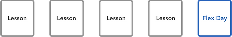
Adding Entry Point Two: Adding in-lesson trigger button on Flex Day lesson cards
Purpose: Just-in-time support


USER INTERFACE
REFLECTION
In this data visualization project, there are some highlights of the thinking behind the design:
-
Connects the dot
-
Helps user absorb the information quickly
-
Holds the audience’s interest longer
-
Helps find the outliers
-
Surfaces the insights
-
Tells a visual story
-
Is easy to understand
-
Is tailored for target audience
-
Answers specific question
-
Is user friendly
-
Provides context and guidance on actions to be taken