
SHOWMATE
ShowMate is a concept mobile app designed for non-English speaking young professionals to have contextualized English language learning experience around movies & TV shows. ShowMate segments the show watch time and language study time by using its seamless contextualized subtitle-collection function, which makes the learning more effective and more enjoyable. ShowMate is not only designed for determined and avid language learners, it provides light and fun language learning experience for all the people with different levels of learning commitment.
My Role: Completed the full design cycle: product discovery, user journey mapping, wireframing, hi-fi mockup, prototyping, user testing, iteration.
Tools: MockFlow, Sketch, Principle
Note: This project was a cumulation of a 6-month individual capstone design project for my Master's degree at New York University.

PROBLEM
Learning a language by watching movies and TV shows is not a new method. Many people dropped out halfway, however. On one hand, the lack of motivation is always a big obstacle to the success. On the other hand, even for the dedicated learners, their experience of learning a language from watching shows can hardly be called "pleasant". Why? Because current show streaming platforms are not designed for language learning!
RESEARCH
In order to dig deeper into the pain points the users have, I ran a 2-week research on the young professionals' language learning experience with watching shows on their computers or mobile devices.
Research Methods: online survey + phone interview
Participants: young professionals in China ( the reason is they are the main consumers of English show streaming service, and they have the biggest needs for conversational English learning other than students)

What I heard and saw?
PERSONA & USER JOURNEY

By taking a closer look at the user journey of learning English from watching a show on a regular stream platform, we identified many painpoints along the way.
This is how the current user journey looks like:

So the challenge is: How can I design a learning platform on the basis of show stream tools so that it turns the English learning from show watching more effortless, more effective, and more enjoyable?
DESIGN SOLUTION
The first thing that came to my mind was: I need to detach the learning time from the show watch time - to reduce the cognitive load, and enhance the learning effect at the same time.

STORYBOARDING

WIREFRAMES

USER TESTING
-
Goal: Design concept, key interaction usability
-
Participants: 4 people in total, with 2 college students from NYU, 2 professionals residing in NYC
-
Length: 30-45 minutes
-
Method: Product walkthrough, think-aloud, observation

User Feedback

ITERATION
-
Change of Interaction: Consolidated and simplified the note-taking steps, such that it's less likely to break the watch flow
-
Change of Feature: From saving words and phrases to saving the whole sentence.
Before
After

FINAL SOLUTION
How does ShowMate help address each of the user's pain point
and optimize the whole learning effectiveness and user experience?
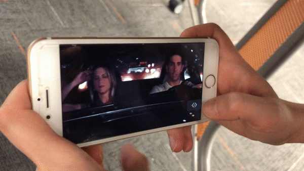
# 1. Seamless Sentence-Collection Function


Cognitive overload
caused by the split attention
SOLVED
The keywords are highlighted to help the user better understand the show. The user can “take notes” by tapping the bookmark button and the sentence will be saved together with the footage to their own “notebook” for later review. The design reduces the user’s extraneous cognitive load by simplifying the “note-taking” process without breaking the watch flow.
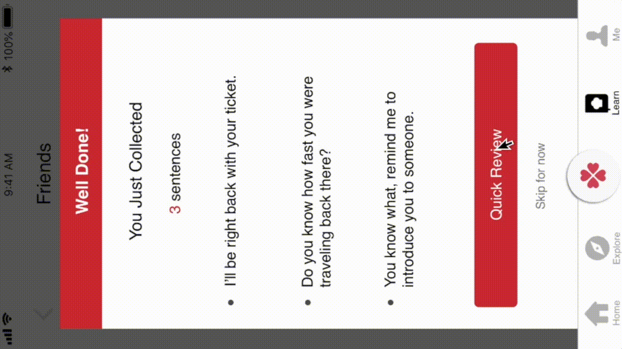
# 2 Contextualized Learning

Once the user finishes watching, they are prompted to take a “quick review” of what they saved. Instead of only giving the learner sentences, ShowMate presents the sentence together with the footage from the show in which it was used!
ShowMate makes meaningful learning happen by connecting the text with sound and context.
Lack of scaffolds, no feedback
SOLVED
#3 Flexible Learning Plan to Engage Learners with Different Learning Preferences


-
Study-plan for avid learners: ShowMate allows them to set up their own weekly review plan over the next few weeks.
-
Gamified sporadic learning to engage users with low-learning commitment: the “clover” call-to-action button on the tab bar is designed to engage people who just want to learn for fun. By tapping on this button, the user will get a random sentence to learn. In this way, the learner will always be curious about what they'll get next.
Lack of motivation,
no tracking of learning progress,
no centralized notes database
SOLVED
FINAL UI DESIGN

DESIGN WALKTHROUGH
NEXT STEPS
-
Adding the onboarding pages and login pages
-
Usability testing with the MVP
-
Consulting with engineers for technology affordance and constraints
This project was supervised by Prof. Christopher Hoadley, and the design pitch won the Rudin Educational Communication and Technology Scholarship 2018.